


Logo Usage
Our logo is the primary identifier for our brand. It is comprised of two elements: the brand name and the icon.
The stacked version is the primary version, with the horizontal being secondary for use when the layout calls for it.
Icon
The Circle V serves as Vannoy’s standalone icon — used in contexts where the full wordmark isn’t needed. It’s immediately recognizable and carries the full weight of the brand on its own.
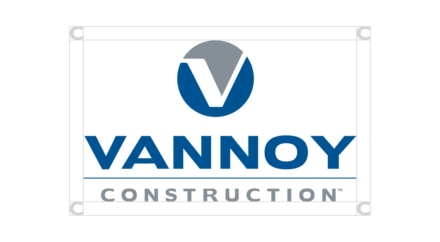
Clear Space
When using the logo, be sure to give it enough room to breathe.
Use the “C” from “Construction” as a border around all 4 sides for spacing purposes.
Color Alternates
There are different versions of the logo to use depending on the background color.
White
The white logo is secondary and should only be used in situations where the primary or inverted logo lacks contrast against a photograph or color background.

Black
The use of the black logo is last resort and only permissible when no colors are available.
The value is 100% black.
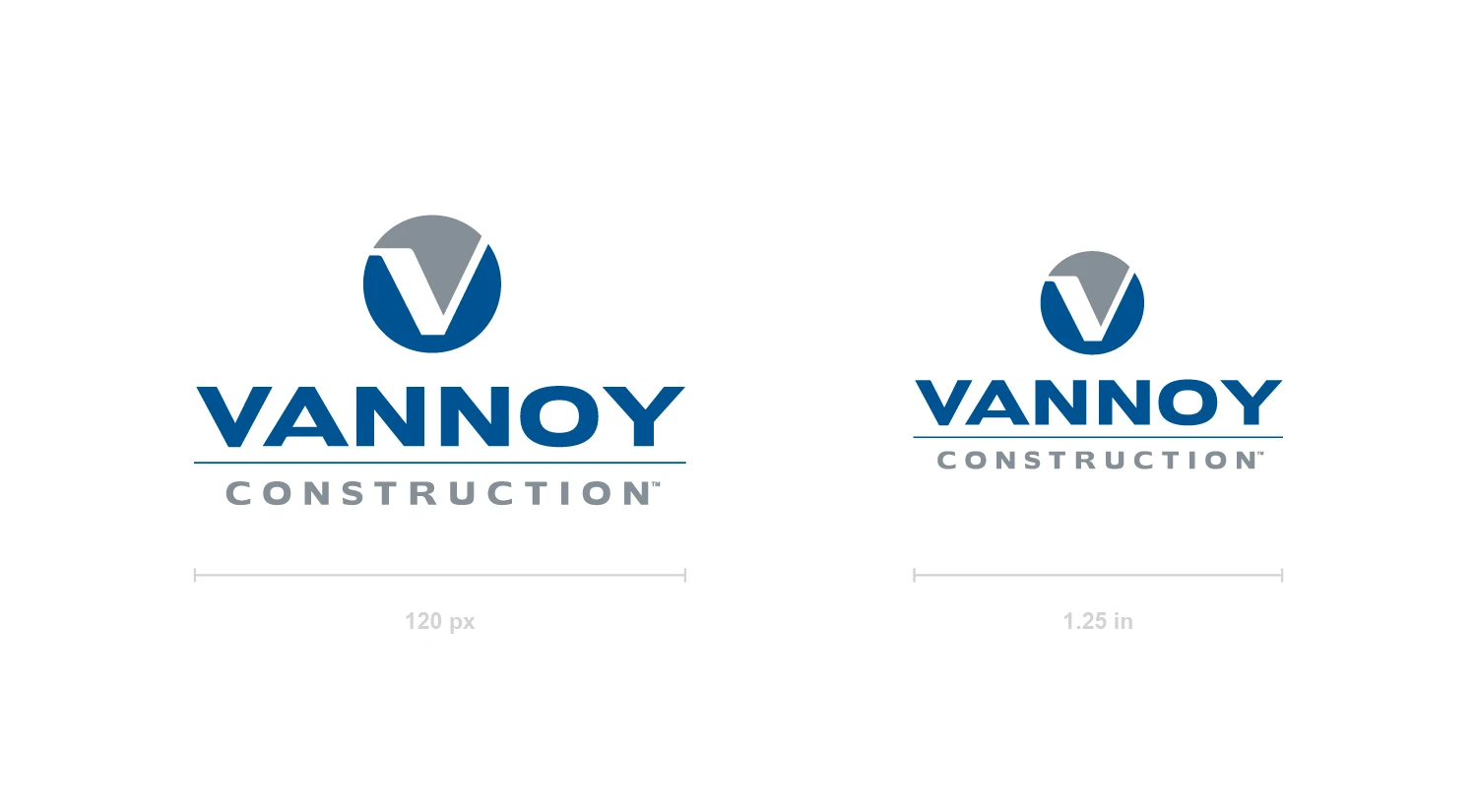
Minimum Sizing
Be aware of making it too small. If legibility is an issue, it’s too small.
Minimum size:
120 px wide (digital)
1.25 in wide (print)
Logo Dont’s
We want to make sure our logo isn’t seen incorrectly. Please avoid altering it in any way.
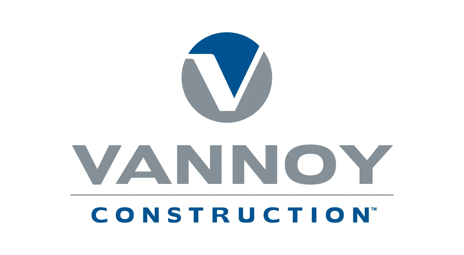
Don’t reverse the logo colors.
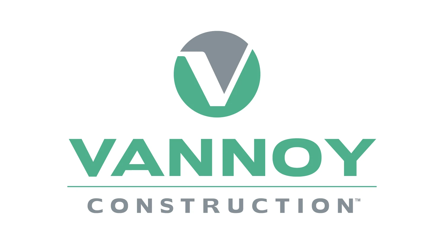
Don’t replace the logo colors with other colors.

Don’t use unapproved one color logos.

Don’t place the logo over busy backgrounds.
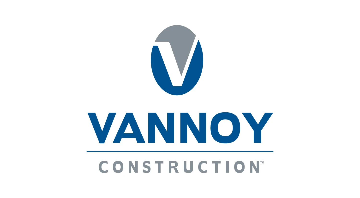
Don’t squish the logo.
Don’t remove any of the logo elements.